 By just about any measure, May was an awful month for investment performance, which is another way of saying that the past 31 days have made stock indices 5% to 10% more affordable than they were in April. However, after the dramatic (and largely unexpected) run-up through the first five months of the year, most of the major indices were still in positive territory after the decline. The Wilshire 5000 index, which is the broadest measure of all categories of U.S. stocks, lost 6.22% last month, but remains up 5.08% with 30 days to go before 2012’s halfway mark. The comparable Russell 3000 index fell 6.18% in May, but is still in positive territory so far this year, up 5.20%.
The stock market is fundamentally a gauge of optimism or pessimism for investors. If we think the future is bright, as most shareholders apparently believed until the end of April, there is demand for more shares and prices go up. So we have to ask: why did sentiment turn around so dramatically, and does the herd of investors know something important about the future?
The headlines have suggested two reasons for gloom. The first is jobs. The latest employment report from the Labor Department shows the first increase in U.S. unemployment in 11 months, as the jobless rate ticked up from 8.1% to 8.2%. In the simplest possible terms, these numbers are interpreted as meaning that companies aren’t hiring new workers as quickly as new workers are coming on the market. However, buried in the Labor Department report is a statistic on “labor force participation” that shows that more than 600,000 people got off their couches and rejoined the work force in May. This means that in May, the jobs market looked so much better that 600,000 people who had ceased looking for work (and because of that were no longer considered unemployed) returned to looking for work and increased the labor force by 600,000. That is actually good news! Workers only go from not looking to looking when they feel more optimistic about the jobs picture.
The report also said that the overall economy had added just 69,000 new jobs. However, a survey from the payrolls processing company Automatic Data Processing (ADP) showed that the American private sector added 133,000 new jobs in May, meaning that 64,000 government jobs disappeared.
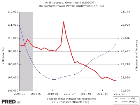
Is this true? If you look at the chart below, the trend is very different from what you are likely hearing in the news reports. The red line, which is trending depressingly downward after a brief stimulus-related spike in 2010, is federal government employment, which corresponds with the numbers on the right-hand side. As you can see, Washington’s payroll is declining dramatically, as the country works to restore its fiscal balance. Since the beginning of 2009, over half a million government jobs have been slashed or eliminated altogether.
The blue line looks a bit more hopeful. That represents the total number of private sector jobs in the U.S., corresponding with the numbers on the left-hand side. The Great Recession caused a dramatic freefall in total private employment that bottomed out around January of 2010. Since then, you can see a steady (and largely unreported) improvement in the jobs picture exactly where we would want it: in the private sector, in the for-profit companies that most of us invest in.
The other reason why investors have become allergic to stocks, according to the press, is the continuing fiscal problems in Europe. Overall Eurozone unemployment has reached 11%, and economists believe that a recession either has begun or is imminent. There are worries that Spain and Ireland could fall into the same economic precipice as Greece. Spain’s 10-year bonds are now trading at a 6.7% yield, their highest level since November.
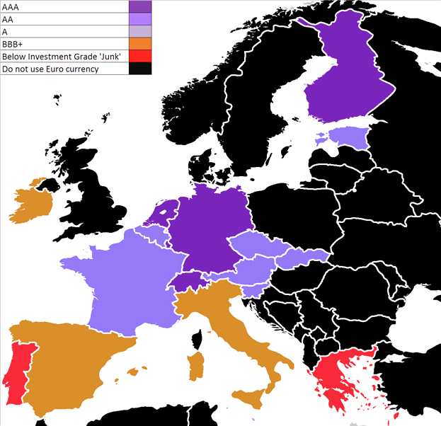
You can see, in the map below, a kind of “cheat-sheet” on where the sovereign debt problems are most acute. Purple countries are not in danger, the orange countries are facing worrisome conditions, and the bonds issued by countries painted in red are basically downgraded to junk bond status. 
The recent selloff suggests that many investors are expecting widespread defaults in Europe that will spread (the word “contagion is often used) to the U.S. banking system, and from there into the U.S. economy, similar to the way the collapse of U.S. investment banks caused the Great Recession.
However, if you read the news reports closely, you see that the European governments have a solution at hand, which some are reluctant to put into place. The new French government has proposed that the European Central Bank be authorized to issue its own bonds. This would make Europe function more like the U.S. fiscal system, where the states (comparable to the individual European countries) issue bonds, and our government (comparable to the ECB) also has the power to sell Treasuries (i.e. to borrow when needed). The money raised by those Eurobonds would be used to contain the crisis, and the interest rate to Eurobond investors would be dramatically lower than what the countries in orange and red are currently paying in the open markets.
Presto! The ECB would step in as their surrogate borrower, swap their high rates for its lower rates, and eliminate the threat of contagion. Of course, this would also expose the purple countries to the credit risks of the orange and red ones (this is why Germany is dragging its feet on the idea), but presumably any deal would come with guarantees about future fiscal discipline, and would remove the crushing borrowing costs from countries as they dig out of their debt. That, in turn, would allow these countries to begin re-growing their economies, which might reduce the size and extent of the expected Eurozone recession.
Armed with this information, pessimistic stock investors might want to take another look at their European fears, and ask themselves: will European leaders eventually accept this way out of the crisis? Or will they allow the economic crisis to spiral out of control?
Meanwhile, it might be helpful to ask: where, in all the world, do investors feel the safest? Recently, German government 2-year bonds were issued at auction, where investors were willing to accept a negative yield for the first time in the country’s history. That means that investors, today, are willing to pay the German government for the privilege of lending to it. Basically, it is the old flight to safety. Many investors in European bonds only want the safe bonds that will not default (Germany) and are willing to forego any positive rate of return for the peace of mind that comes with that safety. The German experience follows a record-setting Treasury Inflation Protected Securities (TIPS) auction issued by the U.S. government, which was also priced at a negative yield. These are unprecedented events, and suggest that you and I are fortunate to be living in a nation whose debt is regarded by investors as one of the safest havens in the history of finance.
So what does that mean for the equity markets? Well, for the US it means we are headed for more volatility until there is some sort of lasting improvement in the Eurozone debt crisis which has yet to play out and the US unemployment rate drops significantly which we do not predict will occur prior to the November elections. As a result, the equity markets will look like a roller coaster for the rest of 2012 but should improve with 2013. As long term investors, we continue to urge you to stay invested.
Sources:
Wilshire index data: http://www.wilshire.com/Indexes/calculator/
Russell index data: http://www.russell.com/indexes/data/daily_total_returns_us.asp
Jobs data:
http://news.xinhuanet.com/english/world/2012-06/02/c_131626282.htm
Government and private sector jobs:
http://thinkprogress.org/economy/2012/03/09/441327/public-sector-2011-gop-candidates/
Drop in oil prices: http://www.bloomberg.com/news/2012-05-30/crude-poised-for-biggest-monthly-decline-since-december-2008.html
Spain’s borrowing costs: http://money.cnn.com/2012/05/30/investing/world-markets/index.htm
European debt ratings and the Eurobonds proposal: http://www.dailyfx.com/forex/education/trading_tips/daily_trading_lesson/2012/05/30/Simple_explanation_to_Euro_Crisis.html
